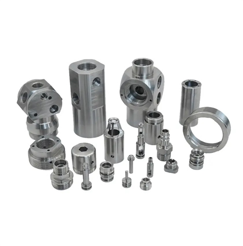
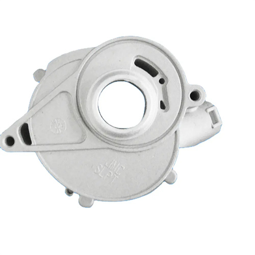
Die-cast text logos and graphics
Die-cast text, logos, and patterns are crucial vehicles for product information transmission and brand recognition. They are widely used in machinery nameplates, operating panels, and decorative components. Their clarity and durability directly impact product usability and brand image. Design considerations must be balanced between readability, process feasibility, and long-term usability. Precise mold processing and process control ensure the integrity and clarity of text and patterns during production, avoiding blurred strokes or missing details that could affect information transmission.
The design of text and logos must adhere to the principles of clarity and legibility. Choose a sans-serif font (such as boldface or Arial), avoiding the complex strokes of artistic fonts that make filling difficult. Key information, such as product model numbers, should preferably be in boldface, with uniform stroke thickness for high legibility. The font size should be set according to the size of the casting. For small castings (<100mm), the text height should be ≥2mm; for large castings (>300mm), it can be 5-10mm. The stroke width should be 1/5-1/3 of the height. For 5mm-high text, the stroke width should be 1-1.5mm, ensuring a continuous, unbroken stroke. The depth should be controlled between 0.3-0.8mm. A stroke that is too shallow (<0.3mm) is prone to wear, while a stroke that is too deep (>1mm) can easily chip. For example, a brand logo originally had a depth of 0.2mm, which became blurred after six months of wear. A change to 0.5mm significantly improved its durability, allowing it to remain legible after three years of use.
Pattern design must balance complexity and manufacturability. Line pattern widths should be ≥0.3mm, with a curvature radius ≥0.5mm. Sharp angles and thin lines should be avoided. Decorative curves should use a 0.5mm wide, 1mm radius rounded transition, with a fill completeness of 99%. Fill patterns (such as corporate logo blocks) should have a 30°-45° transition slope to prevent right-angle steps from causing molten metal accumulation and porosity. A home appliance logo had an 8% porosity rate due to right-angle transitions; this defect was eliminated by switching to a 30° slope. The spacing between combined pattern elements should be ≥0.5mm, with 1mm spacing between text and graphic logos to ensure clear boundaries. A combined pattern on an electronic product was blurry due to a 0.3mm spacing; adjusting to 0.6mm improved its legibility.
The die-casting process for text and patterns requires precise control of details. Mold processing utilizes electrospark engraving or laser marking, achieving an accuracy error of ≤0.02mm and a surface roughness of Ra ≤1.6μm. Laser-engraved text strokes are burr-free and highly legible. During die-casting, the mold temperature in the text and pattern area is elevated by 10-20°C, reaching 230-270°C for aluminum alloy molds, to facilitate the molten metal filling of the details. In one case, a logo exhibited missing strokes due to localized low temperatures. After heating, the integrity of the strokes increased from 85% to 100%. The injection speed is controlled in stages, decreasing by 10-20% when filling the text area to prevent molten metal from eroding and causing pattern deformation. For one text logo, this staged speed control reduced the stroke deformation rate from 5% to 0.5%. Furthermore, micro-venting slots (0.03-0.05mm deep) are installed in densely text-filled areas to prevent air from being trapped between strokes.
Quality control must cover both appearance and durability. Appearance inspection uses a 10x magnifying glass to detect missing strokes, broken scratches, and burrs. Any missing strokes exceeding one-third of the length are considered unacceptable. One batch of products had an 8% missing stroke rate, which was reduced to 1% after rework and mold adjustments. Dimensional inspection uses an image measuring instrument, with text height tolerance controlled to ±0.1mm. 5mm high text measured 4.9-5.1mm. Durability is verified through friction testing. After 1000 cycles of rubbing with cotton cloth (with a pressure of 5N), the wear depth is ≤0.1mm. The text markings on a piece of outdoor equipment passed this test, demonstrating compliance with harsh environmental requirements. Environmental testing (high and low temperature cycling and salt spray testing) is also conducted to ensure that the text and patterns retain their integrity and color even under extreme conditions.
Design optimization must integrate user experience and brand image. The brand logo must be consistent with the VI system, achieving color matching through die-casting and surface treatment (anodizing and electroplating). One company’s logo, after anodizing, matches the brand’s primary color, ensuring high recognition. Instructions must be clear and easy to read. Warning text is bolded and enlarged. “Caution: High Temperature” signs are 50% taller than standard text, complementing warning graphics to enhance safety. User research optimizes layout, placing handheld device operation text within easy thumb-viewing areas for enhanced convenience. One appliance company moved the text on its control panel from the top to the front, resulting in a 20% increase in user satisfaction. Moldflow software simulates the impact of text on molten metal flow, optimizing layout and preventing fill defects. Simulations adjusted the position of a complex pattern, reducing fill time by 10% and improving molding stability.